AI UI design works best as a workflow, not a single prompt. Write a short brief, gather references, generate several directions, then refine the best one against a design system, check accessibility and hand it to code. Tools such as Figma Make, Google’s Stitch and v0 can turn a prompt into working screens in minutes.
The generic AI look does not come from the tools. It comes from skipping the brief and the refinement. This guide covers the tools worth knowing as of September 2026, a six-step workflow, and the specific habits that make generated screens look designed.
- Start with a brief and real references. A vague prompt gets the same safe layout everyone else gets.
- Generate several distinct directions, pick one, then refine it against fixed colors, type, spacing and components.
- Check accessibility before handoff. WCAG’s AA level asks for 4.5:1 text contrast and 24 by 24 pixel targets.
- Hand off through code or an MCP server, so your design system travels with the design.
- Let AI produce options and states. Keep hierarchy, copy and flow decisions for yourself.
The AI UI design tools worth knowing in 2026
The field moves monthly, so here is what each main tool does according to its own pages in September 2026. Prices and limits change often; check before you commit.
Turns prompts, attached Figma frames and design context into prototypes and web apps that are backed by code and still editable visually. Full access comes with a Full seat on a paid Figma plan, and other seats and the free plan can try it with limits. The Professional Full seat is listed at $16 a month with 3,000 AI credits.
Google’s March 2026 update added an infinite canvas, a design agent, voice input and clickable prototypes. A DESIGN.md file carries your design rules between projects and tools, and an MCP server and SDK pass designs to coding tools.
Vercel’s tool generates working interfaces as code. Since its February 2026 rebuild it can import a GitHub repository, open a branch and pull request per chat, and deploy to Vercel.
Generates wireframes and screen designs for web apps, with handoff built in. It has a free plan, with paid plans for heavier use.
Builds a sitemap and wireframes from a brief, using human-designed components, and exports to Figma, Webflow or React with Tailwind CSS and shadcn/ui.
Coding agents belong on this list too. With your components and a clear brief, an agent can build an interface directly in your codebase, which skips the handoff entirely. Our guide to building a website with AI shows that route for sites.
A six-step workflow from brief to handoff
Write a one-page brief
Name the user, the main job of the screen, the real content and the constraints: platform, screen sizes, brand. “Clean and modern” is not a direction. “Dense, calm, built for people who live in it eight hours a day” is.
Collect references and say why
Gather three to five screens you admire and write one line about each: the spacing, the table density, the way errors appear. Study them for principles, never to copy them. Our guide to recreating a design legally draws that line.
Generate distinct directions
Ask for three directions that differ on purpose: density, type, color, layout. Judge them in grayscale first, because hierarchy that only works in color is weak hierarchy.
Refine against a design system
Pick one direction and lock it down: a color palette, a type scale, a spacing scale, corner radius and a small set of components. From here, every generated screen must use only those.
Check accessibility
Test text contrast, target sizes, keyboard focus and error messages before anyone builds it. The numbers are in the next section.
Hand off to code
Give developers, or a coding agent, the design together with its rules. Figma’s MCP server passes variables, components and layout into coding tools, and Stitch exports through its own MCP server.
Give the AI a design system it cannot ignore
Most off-brand screens happen because the model was never told the rules. Write them down once, in a file both you and the AI can read. Stitch calls this file DESIGN.md; any name works for a coding agent. Here is a small example:
# Design rules: Ledger dashboard

## Color
- Text #1C1C1E, secondary text #5F6368, on white #FFFFFF
- Primary #0B57D0 for one main action per screen, never for decoration
- Error #B3261E, always paired with an icon and a message

## Type
- Inter, sizes 12, 14, 16, 20, 24, 32 only. Body text 16.

## Spacing and shape
- 4 px grid: 4, 8, 12, 16, 24, 32, 48. Corner radius 8, buttons and inputs only.

## Components
- Use only: Button, Input, Select, Table, Card, Dialog, Toast.
- Every list has an empty state, a loading state and an error state.
Then say it plainly in every prompt: use only these tokens and components, and ask before inventing a new one. In Figma Make, design context can come from your libraries and guidelines, so the rules live in one place.
Check accessibility before anyone builds it
Generated screens can look fine and still fail basic checks. These are the minimums from WCAG 2.2, the web’s accessibility standard, at level AA:
Contrast is where pale grays fail. #A1A1AA on white scores 2.56:1, well under the minimum. #5F6368 scores 6.05:1 and passes, while still reading as secondary. Also check that every control shows a visible focus ring, and that color is never the only signal, since an error needs words too.
Review this screen against WCAG 2.2 level AA. List each problem with the element, the rule it breaks and a fix that stays inside my design tokens.
Check text contrast (4.5:1, or 3:1 for large text), target sizes (24 by 24 CSS pixels), visible keyboard focus, labels on every input, and meaning carried by color alone.
Flag anything you cannot verify from the image, instead of guessing.
Treat the AI’s answer as a first pass. Confirm contrast with a real checker and try the flow with a keyboard yourself.
How to avoid the generic AI look
Ask an AI for “a modern landing page” and you get the average of everything it has seen: a centered headline, a soft gradient, three icon cards in a row, rounded everything. That is what “generic” means. It is not wrong, just anonymous.
- Many layout options in minutes
- Filling screens with realistic data and every state
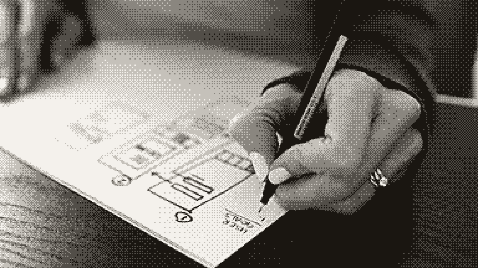
- Turning a rough sketch into a clean screen
- Checking screens against written rules
- The same safe layout for every brief
- Components your design system does not have
- Pale text and small tap targets
- Missing empty, error and loading states
- Marketing copy where plain labels belong
The fixes are specific. Write real copy before you generate, so the layout serves your words. Choose type and color on purpose, or borrow them from your brand kit (our guide to logos and brand assets with AI covers that). Then design the unglamorous states, because that is where products feel finished.
Finally, ask for critique, not just output:
Act as a senior product designer reviewing this screen for [user] doing [main task].
Rank the three biggest problems with hierarchy, spacing, density and clarity. For each, explain what a user would struggle with and propose one concrete change.
Do not suggest new colors, fonts or components outside the attached design rules.
FAQ
Which AI UI design tool should I start with?
If your team already works in Figma, try Figma Make, since it can use your libraries. For fast exploration on a canvas, try Stitch. If you want code you can ship, try v0 or a coding agent in your own project. For marketing sites, Relume starts from a sitemap.
Can AI follow my design system?
Yes, if you give it the rules as files rather than adjectives: tokens, a component list and examples. Tell it to use only those and to ask before inventing anything. Then check every screen, because models still drift.
Is AI-generated UI accessible?
Not by default. Generated screens can ship low-contrast text, small targets and color-only signals. Run a WCAG check on every screen, and test the main flow with a keyboard before handoff.
Will AI replace UI designers?
It speeds up much of the production work: first drafts, variations, states and specs. The decisions that make a product good are still human: what to build, what to leave out, and how it should feel.
- A brief and references matter more than which tool you pick.
- Generate distinct directions, then lock one down with written design rules.
- Check contrast, target size and focus before anything gets built.
- Hand off the rules with the design, through code or an MCP server.
Next, make images that fit your interface with image prompts that look professional, or make the page convert with a landing page that works.
- Figma Make, Figma
- Figma pricing, Figma, accessed September 2026
- Figma Make FAQs, Figma Help Center, September 2026
- Guide to the Figma MCP server, Figma Help Center
- Design UI using AI with Stitch from Google Labs, Google, March 2026
- Introducing the new v0, Vercel, February 2026
- UX Pilot pricing, UX Pilot, September 2026
- Relume, Relume
- Understanding SC 1.4.3: Contrast (minimum), W3C
- Understanding SC 2.5.8: Target size (minimum), W3C